|
A few years ago, if you wanted to learn how to draw Japanese-style comics, the online tutorials created by acclaimed artist Julie Dillon and featured on her seminal jdillon.net website were the only game in town. With the advent of the English-language How to Draw Manga series of books, manga-art instruction has been taken to the next level. But Julie's tutorials remain an excellent --and essential--place to begin your manga art career. The tutorials begin with the basics of drawing hair, faces, bodies and clothing. Once you've mastered those, you may want to try your hand at the tutorials focused on illustrating specific anime characters, including those from the celebrated Dragonball Z series. And finally, Julie gives some pointers on using the Paint Shop Pro and Photoshop image-editing computer applications. |
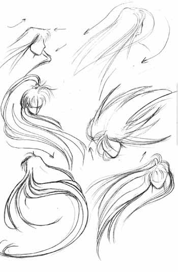
HairsIn this brief tutorial, Julie will share a few tips about drawing anime style hair.Hairstyles and images within are borrowed from other sources (mostly CLAMP characters, but there are others, too). |
Basic Shapes and Components |
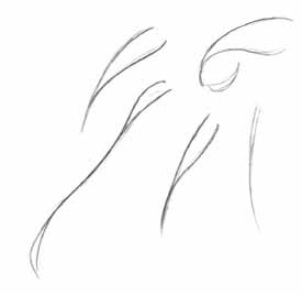 Depending on the style, anime hair can be very complex. However, if you break it down into its basic components, the process of drawing anime hair becomes a little simpler.
Like real hair, anime hair is composed of many strands. However, rather than drawing each individual strand, the hair is often drawn in various sized/shaped clumps, as shown here. These are some of the simplest forms of each hair style. Notice that in most cases, the outline is more curvy on the bottom of the hair clump. This is especially apparent on the top leftmost example; the lower line is curvier than the top line, giving the hair more depth and more of that anime-ish look. Sometimes this is highly exaggerated, and other times it is hardly noticable, but for most anime hair styles, each individual strand of hair will have this basic shape. |
 Once you know how to draw each strand/clump of hair, you can start putting them together to form more something that more resembles anime hair. Look at each example here (well, exept maybe for that one on the lower left; I'm not sure why I left that in), and notice how the basic strands from the first step are used. The same similar shapes generally persist throughout many different hairstyles. Making one line curve out more than the other on each strand can really help to flesh it out.
Another thing to keep in mind is that you can make the hair as detailed as you like; just keep adding more strands. I'll go over this more shortly. ^_^ |
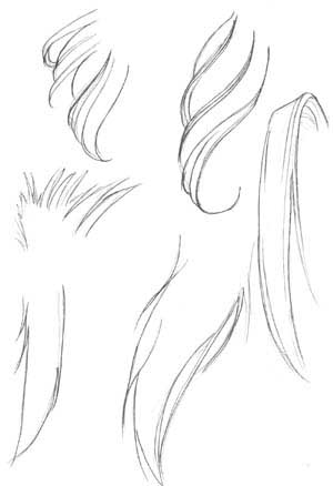 Now, we are getting into some slightly more complex shapes. Notice how varying the size and shape of each strand gives the hair different character; the strands can be long and thin, thick and curvy, or sharp and spiky. Again, notice that you can either make the hair very detailed, or very simple, depending on how many individual strands you draw.
|
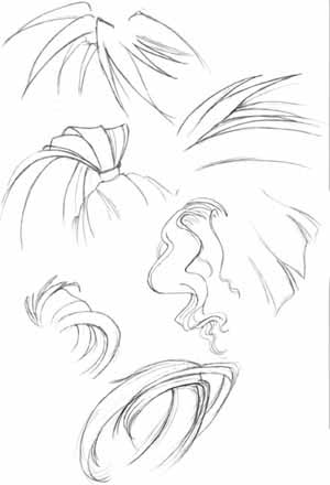 Here are more examples of different basic shapes of hair. Take note of how the hair overlaps and is nested in itself when it bends or twists. You can make some really interesting hair by having it twist and turn all over the page. ^_^
|
Types of Hairstyles |
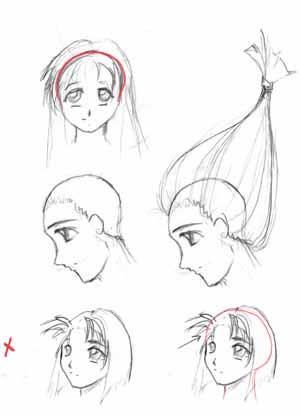 Next, I'm going to go over some different types of hair styles, but before I continue, I want to go over a few things regarding the placement of the hair on the head.
No matter what hairstyle you are going to draw, the hair always grows from the same region of the head, as shown by the example in the middle. It grows out from the entire back part of the scalp, from the forehead to the back of the neck (not just the base of the head, but down the back of the neck, too). It isn't just plopped onto the top of the head. You can generally get away with not paying attention to this fact, but if you are drawing hair that has been pulled back or hair that is trimmed really short, then it will be important that you know where exactly the hair is placed. One reoccuring problem I've noticed with a variety of artists is that they do not take into account the fact that there is a skull underneath the hair. Sometimes artists draw the hair too small for the head, as in the example at the bottom. The bangs stick out, but there is no forehead beneath them; the hair curves down on the head far too low, cutting the head off and making the skull oddly shaped and flat. This is not a good thing. ^_~ If you need to, draw out the character's entire head before adding the hair, so that you are it will fit and look natural. Well, as natural as anime hair can look.. :D |
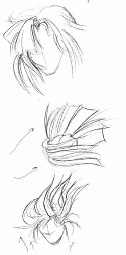
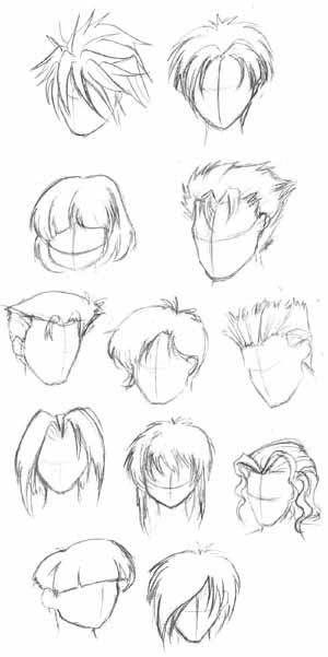 Okay, now that I've gotten that taken care of, here are some examples of different anime hairstyles, all with short hair. Hopefully it might give you some ideas. Notice also that many of these can be used for either male or female hairstyles. I'm sorry these aren't as detailed as some of the previous examples, but you still get the basic idea and shape of each style (hopefully).
|
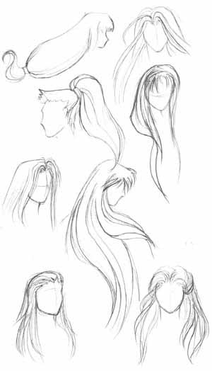 Here are some different examples of longer, flowing hair styles; again, some of these can be used for either male or female, so don't whine at me for only drawing hair for one gender.. ^_~
In contrast to the shorter hair styles, you'll note that a lot of these are composed of long, curving lines. When drawing longer hair, try to avoid making the lines perfectly straight; make sure that the hair follows the form of the head and the body, esepcially if it is sitting on or over the shoulders. When drawing longer hair, you'll especially want to make sure the lines follow the shape and flow of the hair, rather than have it simply fall down in straight lines regardless of the hair's shape. It will give your character's hair much more depth and form if you make your lines work for you; make them show that the hair turns and twists, not that it just sits there on the character's head, or that the main outline of the hair is curvy but the interior strands are all straight. |
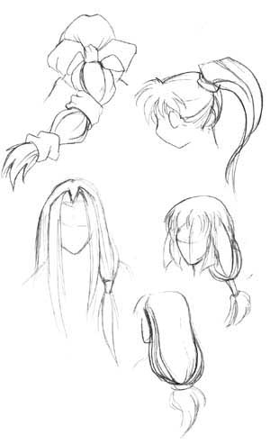
 Here are a few more examples of different hair styles, this time focusing on hair that has been pulled back in ponytails. I don't have much to say about it; I just thought that I should put these in their own section since I had so many of them drawn up. Just remember that when the hair is pulled in a specific direction, the lines and strands of the hair are drawn in that direction, too.
|
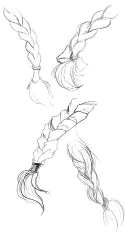
 I also wanted to briefly go over ponytails, and how they can be drawn. You can make them simplistic, highly detailed, or sketchy, depending on your style. Just keep in mind that braids consist of several thick strands of hair being twisted and woven together; it won't just be a straight line. Think of the hair strands as intersecting, inverted teardrop shapes that are linked together. The bottoms are tied off, and fray out slightly.Try to show the thickness of the hair.
|
Motion |
 Now, here is the tough part: putting your character's hair into motion. I'm going to start by going over some examples with long hair.
Anime hair is often drawn whipping about dramatically in the wind; it may look difficult to draw at first, but it isn't that bad. First, decide which direction you want the hair to be blowing. Do you want the hair to move to the sides, to be blown back behind the character, or pushed forward in front of the character? Once you decide, draw the hair (all the hair; bangs move along with the rest of the hair) moving in that direction. It is similar to drawing the hair falling straight down the character's back, except now you are curving it in a different direction. The lines of the hair and each individual strand will be pulled in the direction that the entire mass of hair is being drawn. Remember to use curved lines that follow the form of the hair, not straight lines that simply go from one end to the other. For example, on the topmost right picture, the character's hair is being swept back behind him; thus, I drew the hair curving back behind him in nice, sweeping lines. For some really nice examples of similar hairstyles, find some CLAMP manga such as Rayearth or X/1999; they're loaded with characters with beautiful, sweeping hair. ^__^ All these examples were borrowed from CLAMP's RG Veda, by the way (I was working on this tutorial in the library, and RG Veda was the only manga I had on me... ^_^;). |
 Well, those examples are all well and good if you are drawing a character with really long hair, but what about shorter hair? Shorter hair can be easier, since there isn't as much of it to draw, but it can also be difficult because you sometimes have to pay more attention to each little strand. In these examples (again, borrowed from CLAMP :3 ), the characters all have shoulder-length hair, swooshing about in various directions.
Take particular notice of the top example; the movement on the hair is slight, and thus not all of the strands are bent in the same direction. You don't have to have all the hair jutting out in one direction in order to indicate motion. In the bottom example, notice how having the strands not all move in exactly the same direction gives the hair an interesting floaty feel. If you were drawing really really short hair, then the only motion that you would need to portray would be the bangs, or any other part of the hair that would be long enough to move in the wind. Naturally, if the hair is trimmed extremely close to the scalp, it won't be fluttering in the breeze. ^_~ Thus concludes my hair tutorial. Hope it's been of help! :) If there are hair styles that weren't covered, just go out and find some pictures to use as reference and do some studying on your own. ^_^ And I know I didn't go over how to shade hair; you needn't remind me. Hopefully I'll be able to address that subject in the future, but I can't promise anything. |
Clothing and FoldsThis is a tutorial to give you some ideas on various types of clothing and folds. This is a brief overview. If you need more help on the subject, it is highly recommend that you purchase the folds and clothing book found here.Most, if not all of the poses and clothing within were borrowed from various sources, including anime art books and manga (such as Weiss Kruez, Rurouni Kenshin and Xenogears). If you recognize them, good for you. ^_~ I take no credit for creating the original images. This tutorial is dedicated to Freja, who was a big help and offered comfort in times of strife. This took me a long time to put together, but here it is nonetheless, Freja, just as promised! :) |
Part 1: Basic Folds |
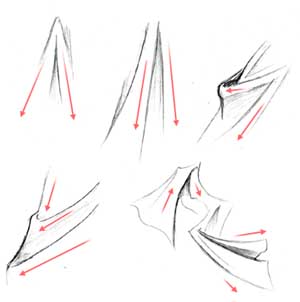 The most important thing to consider whenever you are drawing clothing or any type of fabric is the direction the fabric is going to be pulled in. Folds are caused wherever the fabric is being stretched or pulled; figure out how exactly you want the fabric to move, and the rest is pretty easy. Always remember to consider the figure beneath the clothing; the cloth should reveal the shape of the figure beneath. I'll go into more detail on this later.
At the left are some examples of basic types of folds. Notice the movement of each example shown; the fabric flows downward on the top left two, for they are being pulled down by gravity. This type of fold would be on something that hangs loosely, such as a cape or long shirt. On the lower left and upper right examples, the fabric is not only pulled by gravity, but stretched to the left (probably by an arm that is underneath the clothing). The folds become more horizontal than vertical the further it is stretched. Also notice how sometimes the folds are nested within one another. This will often occur at joints or areas in which loose clothing is bunched up. The lower right picture is a slightly more complex example of a more inert piece of cloth being pulled in a viarety of directions. Notice how the folds follow the direction that the cloth is being pulled in. |
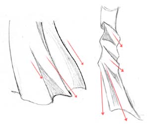 Here are a few more examples of basic fold shapes. On the left, the cloth is being pulled downwards by gravity and to the right by wind or motion. One the left, the long strip of cloth is bunched up near the top. Remember to use shading to give your subjects more form. Generally, you shade along a fold line, or on any places that you think a shadow would be cast. This takes some getting used to. It helps to look at actual folds sometimes to see where to shade. Sometimes, I'll sketch the drapes or a towel hung over a chair just to practice and get a better feel for how clothing is shaded.
|
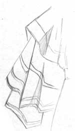
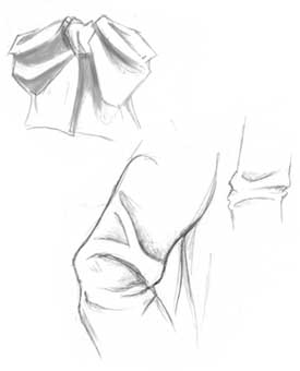 Here are a few more random examples, of a bow and some sleeves. The most important thing to note here is the shape of the folds at the joint of the sleeve in the middle.
|
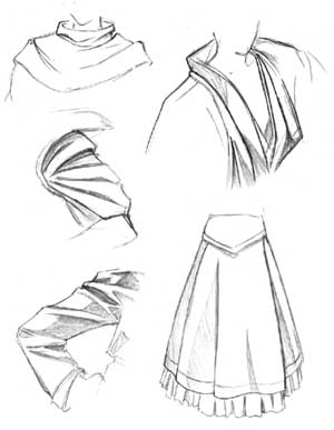
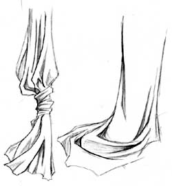 These are some more complex, overlapping and nested folds. The more detail you put into it the folds, the more interesting it will look. On the left, notice how the fabric bunches up where it is tied together; the weight of the fabric pulls it down and causes extra creases and folds to form where it is gathered together. The tie itself is drawn with lots of detail, and the cloth beneath it blows loosely in the wind. The fabric is shaded around the folds and in the crevasses formed by the cloth. On the picture to the right, a length of fabric is draped upon the floor; notice how the folds nest in one another and overlap, creating an interesting effect.
|
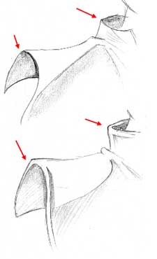 Another thing I want to point out is the thickness of the fabric in question. The fabric on the top example appears thinner than the fabric in the lower example. Take note of both collars. On the top, the circular rim of the collar connects directly to the rest of the collar, while on the bottom, there is a space between the circular rim and the vertical part. The same applies to the edges of the cape. While on the top example, the edge is crisp and thin, on the bottom example there is extra space between the rim and the rest of the cape. This extra space makes the clothing look more thick and heavy.
|
Part 2: Various Clothing |
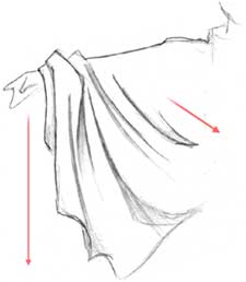 Now that we know a few of the basic shapes of folds in fabric, let's move on and see how clothing should look when it is actually being worn by someone. At the left, we have an example of a very loose, draping sleeve. As mentioned before, the main thing to consider is which direction the fabric will be pulled. The sleeve here is being pulled in two main directions: downwards because its pulled by gravity, and to the left because its attached to the main garment and is being stretched across the arm and torso. The folds in the sleeve will follow the direction that the cloth is being pulled. Notice also how the cloth bunches up around the wrist. This isn't necessary, but it does indicate the length and looseness of the sleeve.
|
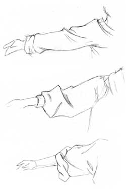 Here are three more sleeve examples. These sleeves are not as loose as the one shown above, and all stick pretty close to the arm. In these examples, the cloth is stretched from the arm to the shoulder and torso, rather than being pulled down mainly by gravity. There isn't enough material to be pulled down too greatly. Since the fabric is pulled horizontally, the folds should reflect this. The best example is the top picture here; notice how the folds move towards the shoulder instead of towards the ground. The sleeve in the middle picture is a little looser, and is pulled down by gravity more. The sleeve in bottom picture is big and loose, but is rolled up at the elbows, and thus doesn't hang and droop as much as the sleeve in the previous example.
|
 These are some miscellaneous bits of clothing that didn't fit into any of the other sections of this tutorial, but that I wanted to include anyway. In all these examples, try to identify where the cloth is being pulled towards and in what direction (for example, is it being pulled roughly towards the shoulder, or draping loosely over the subject?). Always remember to shade wherever the light doesn't fall, such as grooves, areas inside the folds, and places where the cloth overlaps.
|
 One small but important thing I would also like to go over before continuing is the effect that stripes can have. If you are drawing clothing that has stripes or a pattern on it, make sure that the pattern moves along with the rest of the fabric. Where the cloth bends, the stripes and patterns will bend, as well. This can be difficult to draw and shade, especially when you are dealing with complex patterns, but it can add a really nice three dimensional look to your picture.
|
Part 3: Specific Clothing |
 Now that we know some basic shapes and know a little more about how clothing should fit on your subject, let's work on the actual parts of your character's wardrobe. We'll start off by going over basic shirts. Whatever type of shirt you draw, there are some basic places where folds will occur. Sleeves will be stretched towards the shoulder. Fabric generally gathers and bunches up around the armpits and waistline. If you are drawing a character with a heavy jacket or a loose shirt, the fabric should be thick and baggy and full of folds and creases, while if it is a tighter fitting garment, the clothing will stick pretty close to your subject (which is why it is important to be able to draw bodies; I have found that you cannot always cover up your entire character with really loose clothing to hide the fact that you aren't very strong in figure drawing. ^_~)
|
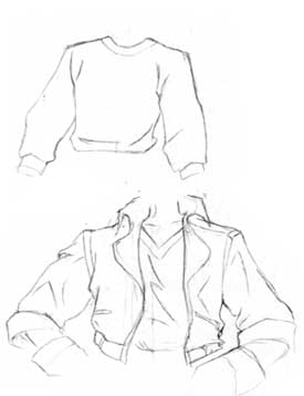
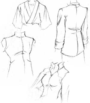 Here are some better examples of various shirts and clothing for the upper body. Notice that while some clothing fits closer to the body than other clothing, you still see many folds where ever the fabric is being stretched. Generally, you'll see folds the most at the armpits, upper portions of sleeves, waistlines, and depending on how tight the outfit is, the chest (as shown in the lower two examples). Also make sure that any seams that are visible on the clothing follow the shape of the cloth and the character that is wearing it. ^_^
|
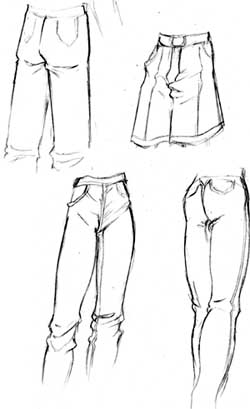 All right, let's work on the pants (something that I personally sometimes find a little daunting... ^.^;) I have noticed that guy's pants tend to be a little looser, while girl's pants cling closer to the subject. Also take note that female's rears tend to be more round, while guy's are tend to be flat and squared off (a rather strange observation, I know. ^_^;) No matter which gender you are drawing, the fabric will gather around the lower waist, knees, and ankles. The cloth around the upper and lower legs is generally pulled straight down by gravity and won't have too many folds, unless the leg is lifted up, in which case you'll have folds similar to the sleeves on the previous page.
|
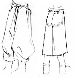 Here are two more examples of clothing for the lower body. The one the left is an example of really loose, baggy pants. The material is has more folds than normal pants, and in this case gathers at the ankles. Notice how poofy the pants get below the knees. The example on the right is just showing how no matter what you character is wearing, you need to consider the form of the figure beneath the clothing. In this case, the clothing is relatively tight, but hangs down past the knees, and thus is drawn a little tighter around the rear. Also notice how the loose fabric bunches up right above and below the belt. That concludes my tutorial on drawing clothing. It isn't the most organized tutorial, but I'm hoping that it covers enough areas so that it can be of some help to you. ^_^
|
General Anime FacesIn this tutorial, I will attempt to go over some basic methods to draw general anime faces, so you can both get a better idea of how anime faces are drawn and proportioned, as well as an idea of how use what you know to create interesting original characters. I've divided this tutorial up into four sections. |
General Anime Faces |
Female eyes |
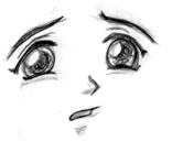
| The eyes are one of the most important features of anime style characters; they are the most expressive parts of the face, and are part of what makes each character different and recognizable. Thus, it is very important to be able to draw them correctly. In this section of the general face tutorial, I will show you how to draw a variety of anime style eyes. A lot of other sites only show you how to draw large female eyes, without really going over the large variety of other styles. In this tutorial, I will cover different types of male and female anime eyes, plus give you examples of numerous other styles for you to use to help you draw your own original characters, or to refine your style with existing characters. |
Female Eyes
 Lets begin with the most basic and common of anime eyes, the large female type. Start off by drawing a line that curves upwards, and is slightly thicker at the highest point. This eye will be on the right side of the face, so make the left end of the curved line higher than the right. The top of this particular eye (Lina Inverse's eye, (from Slayers) actually ^.^) isn't a perfect curve; it is slightly angular. Some styles of eyes are nearly perfectly curved on the top.
|
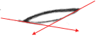
 Next, you want to draw in the lower part of the eye. To help you place the lower half, lightly draw diagonal lines pointing down, starting at the edges of the top part of the eye. The steepness of the slope of these lines will determine how large and wide the eye will be. If you look at the other tutorials on this page, you will see that the steepness of these lines varies. Using these lines as a guide, draw the lower part of the eye. It should slope down to the right a little, and should be thicker at the right corner.
|
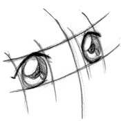
 Erase the guidelines and draw a long oval within the eye. Some characters have large circles for irises, but this particular one has thin ovals. You can adjust the shape so it's wider, if you like. Make part of the oval obscured by the upper part of her eye. With all styles, the complete iris is rarely visible; part of it almost always is concealed by the border of the eye.
|
 Next, draw the outline of the light glares. Anime characters' eyes should always have at least some sort of shading. Anime females in particular tend to have really heavy shading and lots of shiny areas. Make sure you choose a light source, and stick with it throughout your picture. For example, since the light is coming from the left in this picture, I have to make sure all the highlights on the rest of the picture originate from the left, or the lighting will be inconsistent (unless I'm using multiple light sources, but I won't get into that). Draw two long ovals: a large one on the left side of the iris (which overlaps the outline of the iris, as you can see), and a very small one on the other side of the eye.
|
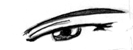
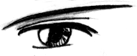
 Next, draw the pupil underneath the light glares. The highlights are always on top; never draw the pupil on top of the light glares. Draw the eyelashes, too; with this particular eye, the eyelashes are a series of spikes coming off of the top-right part of the eye. Make the spikes follow the curve of the eye, so it looks like they are coming off of the eye; don't just draw zig-zag lines sticking out of her eye. ^_~ Also, draw the eyelid on the left part of the eye. Its just a thin, curved line originating from the top of her eye.
|
 Set Layer 1 to "Preserve Transparency" by checking the box on the Layers menu, as shown at the left. This allows you to paint on top of the existing lines without coloring over them and messing them up. Its a very handy feature. :) Select a big paintbrush and paint over the entire picture with pure black. The outline should be back to its former darkened self. :)
|
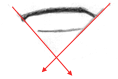
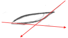
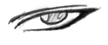
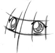
 Okay, now we are going to draw another style, one that isn't as common. This eye is much more slender, elegant, and realistic looking, and is used in more serious anime and manga. This particular eye belongs to Deedlit from Record of Lodoss War, which is a considerably more serious show than Slayers (which is where the previous eye came from). Begin by drawing a long, slightly curved line. The left side should be lower than the right, and the line should curve in sharply at the left edge.
|
 To help you define the sides and bottom of the eye, lightly draw two diagonal guidelines that originate from the edges of the eye. Unlike the previous tutorial, these lines are not very steep; the more horizontal the lines are, the smaller the eye will be. Don't make them too flat, though, because you don't want this eye to be too squinty. Using the guidelines, draw the bottom line of the eye.
|
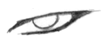
 Erase the guidelines and draw the outline of the iris. If there were no eyelids, the iris would be a perfect circle. However, since the iris is bordered by the eyelids, the top and bottom of the iris will be hidden from view. The iris should not be so small that you can see the entire thing (unless you wanted to convey certain emotions like anger or surprise, but that is covered in another section).
|
 Next, draw the light glares on the iris. The placement is the same as in the previous tutorial, but like the iris itself, the glares are much smaller and more circular. Draw the eyelid above the top line of the eye, as well.
|
 Draw the eyebrow and shading in the rest of the iris. Remember to draw the pupil beneath the light glares, and to make it stand out from the rest of the eye a little no matter how darkly you shade the rest of the iris.
|
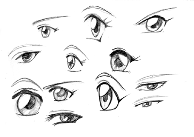 Here are a variety of other styles of female eyes you can make using the same methods. Try to see the differences between each style, as well as the similarities. Though the shape and proportions change, the top border of the eyes is always thicker, there are always multiple layers of shading on the irises, etc. Some of these were sketched fairly quickly and are a little messy, but I hope they are still helpful. ^.^;
|
Male eyes |
| The eyes are one of the most important features of anime style characters; they are the most expressive parts of the face, and are part of what makes each character different and recognizable. Thus, it is very important to be able to draw them correctly. In this section of the general face tutorial, I will show you how to draw a variety of anime style eyes. A lot of other sites only show you how to draw large female eyes, without really going over the large variety of other styles. In this tutorial, I will cover different types of male and female anime eyes, plus give you examples of numerous other styles for you to use to help you draw your own original characters, or to refine your style with existing characters. |
Male Eyes
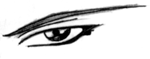
 Next we will draw some male eyes. Male characters are sometimes neglected by fan artists, because many fan artists have trouble drawing guys. They really aren't that hard, though, just different. Most male eyes are more thin and narrow than female eyes, though there are several exceptions. This particular eye (which I think belongs to Hotohori from Fushigi Yuugi) is narrower than other female eyes, without being so thin that it looks like it belongs to a more shady, suspicious character. ^_^ Begin by drawing a thick, very slightly curved line. Its almost horizontal, but still has a slight curve to it. The edges should curve inwards a little, more so on the left.
|
 Lightly draw two diagonal lines, starting from the edges of the top line, to help define the lower part of the eye. The lines are almost perpendicular to each other. Don't make them too steep or too flat, or the size of the eye will be off. Draw the lower line of the eye, using the guidelines to help you position it.
|
 Erase the guidelines and draw the iris. The iris is a perfect circle, but is paritally covered up by the eyelids. Do not draw the iris so small that you can see the entire thing (unless trying to convey a strong emotion like surprise or anger, which is covered in the expressions section).
|
 Male characters have light glares in their eyes, too, though they often are not as large or obvious. Draw one oval light glare on the left side of the eye, and a pointed one on the right side.
|
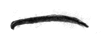
 Draw the pupil benath the light glares and shade heavily, especailly if the character has darker colored eyes. Draw the eyelid and eyelash. Male characters tend to have darker, thicker eyebrows, so make sure they aren't too thin. There, that wasn't too hard, was it? ^_^ Don't worry if the eyes look too 'girly'; often times its hard to tell if some eyes belong male or female characters. Some styles of eyes are interchangable and can be used for either gender.
|
 Slender, narrow eyes are often (but not always) associated with darker, brooding characters. Villains often have narrower eyes, but not all characters with such eyes are antagonistic. To draw this style of eye, start with a long, curved line. Notice that the curve is steeper on the left hand side than the right.
|
 Next, draw two diagonal guidelines from the edges of the top of the eye. The angle of these lines are different from the ones in the three previous tutorials; the left one is much flatter than the the right. Draw in the lower part of the eye using the guidelines; it should be curved, rather than a straight line, so that the entire eye is like an elongated, pointy oval.
|
 Erase the guidelines and draw the iris. The iris is covered up by the upper eyelid; if the eyelids weren't there, the iris would be a perfect circle. Thicken the lines on the right side of the eye.
|
 Draw in the light glares, as well as the upper eyelid on top of the eye.
|
 Finish up the eye by adding the pupil and shading the iris, and adding the eyebrow. Smooth and darken your lines, and you're done. ^_^
|
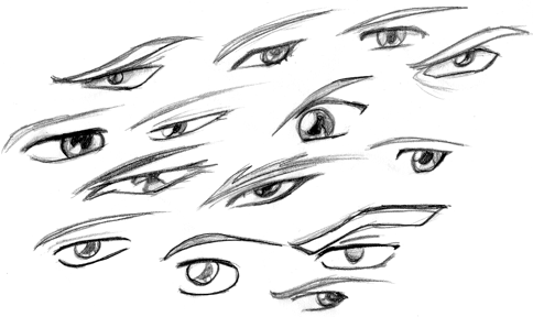 Here is a collection of male eyes. Notice that some could be mistaken for female eyes; the difference between the two genders isn't always that distinct, especially in young children. Most of the eyes here are narrower than the female eyes, and the tops of their eyes aren't as thick. Male characters don't always have light glares on their eyes, but I tend to draw them in anyway. ;)
|
 Once you have the right eye drawn, you're probably going to want to draw the left eye, too. ^_^ All you have to do is draw the mirror image of the exact same eye. The placement of the second eye can be tricky, though. Anime eyes, no matter what style, are always drawn about one eye length apart. The distance may be a little more or less, but one eye length is a good measurement.
|
 You probably are not always going to draw your characters facing towards you, though, so you'll need to know how to line up eyes at different angles. On the head portion of this general face tutorial, you will see that I use curved guidelines to define where I'm going to place the eyes. Always draw guidelines to help you position the eyes, until you are really good at it and no longer need them. You don't want the eyes to be off-center. Notice that in this picture, the right eye is smaller and flatter than the left since it's further away from you.
|
 This is pretty much the same thing, except the head is tilted in the other direction. In this picture, the left eye is smaller than the right. Both eyes still follow the curve of the face. Eyes that don't line up properly can look very sloppy, so be careful.
|
Nose and Mouth |
| Anime style noses and mouths are pretty straightforward, so rather than taking you through various styles step by step, I have several examples for you to use. |
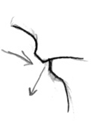
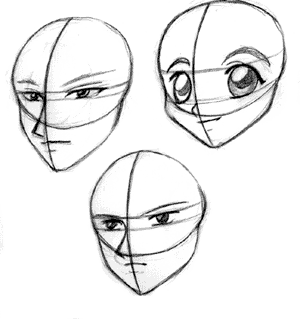
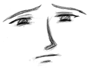
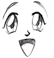
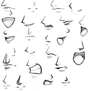 Here is your basic anime style nose and mouth. It consists of three basic simple shapes: a wedge for the nose, a long, thin line for the mouth, and a shorter line to define the lower lip (this lower line is not always included, though). In frontal views like this, you can get away with using very few lines to define the nose and mouth. The size and shape of each feature varies with each character. Always make sure the features line up; to help you line them up, draw vertical guidelines as shown. In the second picture, the face is turned to the side, but the features are still aligned along the curved guideline that represents the center of the face.
|
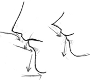
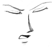
 Drawing the nose and mouth for a profile is more difficult than drawing them from the front or at a 3/4 view. The main reason for this is because you can't get away with not defining the lips as much. ^_^ You have to draw them in, rather than using just simple straight lines. Despite the difficultly, if you get it right, it can look really nice. The main thing to consider is the curve of the nose, lips, and chin. The upper lip curves inward, and lower lip (which is slightly receded on the face) curves outward. It may take some practice before you can get it to look like the character isn't making a weird face or puckering their lips or anything like that. ^_~
|
 The lower half of the face consists of a series of contrasting curves. Notice that how in both pictures, the nose curves in towards the face, then curves back slightly out right above the upper lip. The upper lip curves inward, and the lower lip curves outward. The chin is not just a straight line; it is round and curves outward.
|
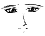
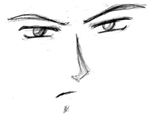
 Here is a selection of examples of different styles of mouths and noses. Several of these can be used for either gender, do I didn't bother separating them. ^_^ Notice that with some styles, the mouth is defined by only a thin, straight line, while with other styles, the lips are more well defined. Anime mouths are not often very large, unless the character is yelling or shouting, so keep them relatively small. The noses vary quite a lot, as well; some are drawn as wedges, some are defined solely with shading, and some are detailed enough that you can see the nostrils. Female characters will tend to have smaller, less defined noses, while male characters will often have longer, angular noses.
|
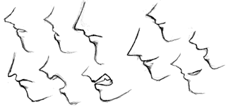 Here are some more examples of noses and mouths, drawn at a profile. Even though the proportions and expressions change, they all stick to the same basic shape as mentioned above. When drawing faces at this angle, be careful not to make the noses really pointy and the face too flat. Make sure the features curve properly, or the face is not going to turn out looking right.
|
Shape of the Head |
| In this tutorial, I'm going to show you how to draw basic anime faces from various angles. Though the faces here are standard anime female faces, the proportions I show you here can be adjusted to fit any sort of character you wish to draw. ^_^ |
Front View
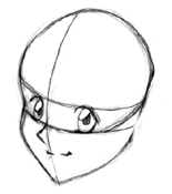
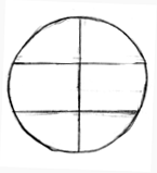 Begin by drawing a large circle. Divide this circle horizontally into thirds, and cut it in half with a vertical line. Do not worry if your horizontal lines don't split the face into even pieces; the proportions will be different depending on the style of face you want to draw, anyway, so its all right if they aren't exact.
|
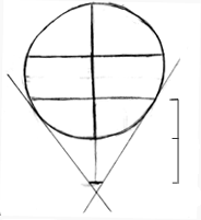 Next, draw a little mark (a short line, not a dot) directly beneath the circle. In this particular picture, the distance from the circle to the mark is the same as the length of the lower third portion of the circle. This mark will represent the chin, so make sure it's a short line rather than a dot or the chin will be too pointy. Raising or lowering the chin mark is one way to adjust the shape and appearance of the face. Next, draw two diagonal guidelines. They should be tangent to the sides of the circle, and intersect the edges of the chin mark.
|
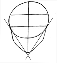 Next, you want to flesh out the face so it isn't so thin. Draw two rounded triangular shapes on each side of the face. Adjusting the thickness of the triangles and the height of the cheekbones (the place where the triangle bends) are ways to alter the shape and appearance of the face and draw different types of characters.
|
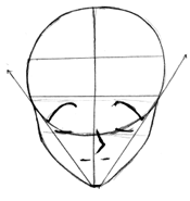 Now that you have the shape of the face down, you will want to add the eyes, nose and mouth. The placement of the eyes varies slightly with each character, but they generally should be located within the lower half of the circle. The nose is about halfway down the lower part of the face (the area below the circle), and the mouth is drawn directly beneath that.
|
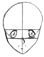 Next, erase those diagonal guidelines and fill in the detail on the eyes. Now you have the basic shape of the face completed, and you can add whatever details you like, such as hair, clothing, jewelry, tattoos, scars, etc.
3/4 View
Next, erase those diagonal guidelines and fill in the detail on the eyes. Now you have the basic shape of the face completed, and you can add whatever details you like, such as hair, clothing, jewelry, tattoos, scars, etc.
3/4 View
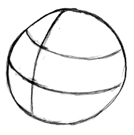 Begin with a large circle, just like you did with the frontal view, except now rotate all the guidelines up and to the left. This part of the head is a three dimensional sphere, so when you rotate it in any direction, the guidelines should follow the curves of the sphere. Divide the face up horizontally into thirds, and vertically into halves. Of course, because of the angle we are drawing this circle at, the guidelines are not going to divide the shape into equal sections, but just remember that if you rotated this shape back to a front view, it should look the same as in the first step of the tutorial for the frontal view.
|
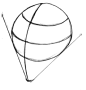 Next, extend the curved vertical guideline down the sphere, and select a point beneath the sphere to represent the chin. The distance from the circle to the chin should be a little bit more than the length of the lower third of the circle. Draw two diagonal guidelines tangent to the edges of the circle that intersect the chin mark. Make sure the left guideline is steeper than the right.
|
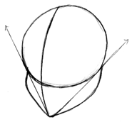 To flesh out the face a little more, draw round triangles on the sides of each of the diagonal guidelines. The left side of the face should curve out where it touches the circle, and the curve of the right side should be more gentle and sloping. It may take some practice to get this to look right.
|
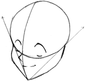 Next, draw the eyes, nose, and mouth. The eyes are located within the lower half of the circle. For more information on how the eyes line up at this angle, go to the anime eye tutorial. All of the features should line up along the central guideline. Do not let your features become lopsided! It won't look right, trust me. ;) The nose generally starts right beneath the eyes, and the mouth right beneath the nose. Notice, though, that the mouth does not extend to the left of the nose; at this angle, most of it stays on the right side of the curved vertical guideline.
|
 Refine the lines a little more, and you have completed drawing the basic shape of the head at a 3/4 angle. From this point, you can add whatever details you like, such as hair, jewelry, etc.
|
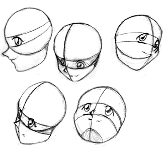 Here are some more heads, drawn at various angles. With every single one, I started with a basic circle and added the guidelines as I did in the previous tutorials (for more info on drawing heads at a profile, such as in the picture at the top left, check out the nose and mouth turorial. The proportions for these faces probably aren't perfect, because the pictures I used as examples had completely different sized features (a lot of them were guys... ^.^).
|
 Of course, there are many other types of characters other than simple anime girls... ^_^ Here is a very small sampling of some other proportions you can try out. They all have the same basic shape, except some of the lines have been lengthened or shortened. In the top left picture, for example, the lower half of the face is longer and thinner, the cheeks are more sharply angled, and the eyes are narrower. On the top right picture, the lower half of the face is much smaller and the eyes are huge. Male faces tend to be longer and more angular, while female faces tend to be smaller and more rounded. Childrens faces, either male or female, are very small and round.
|
Facial Expression |
| Changing the expression of an anime character isn't particularly difficult, but it helps to know which features need to be adjusted for each type of emotion. In this tutorial, I will show you how the various parts of the face work together to convey different emotions. Once you learn what features to change to achieve the look you want, you should be able to draw any emotion you like. Please read through my other facial tutorials, though, since it helps to have a working knowledge of how the features should be aligned before you begin. |
 First, we'll start off going over sadness, a fairly common emotion. This is a trypical anime face, but notice the changes that have been made. The most obvious indicator of the character's emotion, in this case, are the eyebrows. Notice how the inner tips of the eyebrows curve upwards. Also, her lower eyelids curve upward slightly, while her upper eyelids have a more large, round curve. Curving the lower eyelid can indicate stress, sorrow, or anger; in this case, the shape of the eyebrows shows us that it is sorrow. ^_^ Also, notice the shape of the mouth; it is small, and curves downward. Overall, the character looks like she's about to burst into tears.
|
 This form of sadness is more subdued. The character seems depressed, but not as sad as the previous example. The eyes are smaller here (partly because this is a guy ^_^), and the mouth is larger and does not curve down so far. The angle of the eyebrows and the arch of the lower eyelid still let you know that this character is upset about something.
|
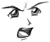 This picture is sort of a transition between sadness and anger. The eyebrows curve down sharply and his mouth is drawn so it looks like he is shouting, both of which indicates that he is mad, yet his irises are still very large. This sort of makes him look like he is angry, yet hurt or upset at someone or something.
|
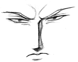 This guy is clearly very ticked off, even though he isn't shouting. ^_~ You can draw angry people without them screaming their heads off. In this picture, the eyebrows are close to the eyes and angle down sharply (I also drew the folds in the skin caused by drawing ones eyebrows together like that), and the mouth angles downwards sharply. The eyes have been narrowed, and irises are very small, which helps to make a character look even more angry. ^_^
|
 I'm not sure about this one; he looks both confused and ticked off. Alternating the angles of the eyebrows like this indicates confusion or incredulity. To add to the expression, draw the mouth slightly off-center, as well.
|
 Its surprising how often anime characters talk with their eyes closed... ^_^ I wonder how many people actually talk like that...? Anyway, closed eyes can express a variety of emotions. Here, they express impatience or annoyance, but they can also express calmness, happiness, or smugness. Flip the eyes around and have them curve upwards, and they can express extreme sadness, as well as excitement. For this particular picture, I made the eyebrows angle downwards and drew the mouth open. Notice how I drew the upper left lip slightly raised; this helps whatever emotion you are trying to convey seem more negative, whether you are drawing anger, unhappiness, or impatience. ^_^
|
 Happiness is one of the most common emotions you see with pictures of anime characters. Excessive happiness or excitement can be expressed by large eyes, highly arched eyebrows, and a big smiling mouth. Other features such as extra shinies in the eyes and the upward curving of the lower eyelid are also common. On a side note, more kawaii characters tend to have huge eyes, and small noses and mouths (unless their mouth is open, as in this picture).
|
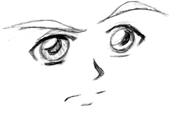
 This character is happy, as well, but not to the extent as in the previous example. The emotion is much more subtle. Notice that the eyebrows have been lowered (though they still arch slightly) and the curve of the mouth is very slight. The lower eyelids are arched, though, and the irises are still pretty large, so though the characters' contentment is not as obvious, it is still clear he's in a good mood. ^_^
|
 To express surprise or shock, enlarge the eyes and make the pupils smaller. This is particularly apparent in anime face faults, when a character is so suprised that his/her eyes become almost as large as the rest of the face... ^_^ In this particular example, the mouth is drawn really small, but other sizes will work too.
|
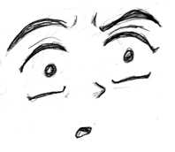
 This guy isn't particularly exciting, he just looks irritated. The irises are small, the eyebrows are arched down, and the mouth is small and slightly off center. I can't think of much else to say for this one... ^_^
|
Female Figure DrawingThis is tutorial on how to draw the female body. Be warned that there is some nudity, though trust me, it is extremely mild. ^_^ If it bothers you that much, just pretend they are wearing skin tight body suits. Also be warned that I am no expert on figure drawing.This is a brief overview meant to familiarize beginning and amateur artists with basic anatomy. If you need more help on the subject, I highly recommend that you purchase a figure drawing book for further reference. Most, if not all of the poses within were borrowed from various sources, including anime art books and manga (mainly the Xenogears Perfect Works ^_^). I take no credit for creating the original images. |
Chest and Torso |
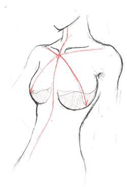 I am going to begin this tutorial by addressing one of the most commonly asked questions that I receive: how to draw women's breasts (heh, I never thought I'd actually be making a tutorial about this.... ^_^). One of the most important things you should consider is to make your subject look natural; you can draw an attractive female without making her look like a "silicon implant ad," as a friend of mine put it. ^_^
 The main problems people seem to have with drawing breasts are the shape and the placement. A lot of artists (professionals as well as ametuers) make them look like balloons that have been taped onto the subject's chest; this is hardly a natural look. If you look through figure drawing books, you'll see that they are more like halves of a sphere or overturned teacups rather than balloons. Now, note the position. Imagine a central guideline that runs down the center of your subject's body, as shown at the left. The breasts are at 45 degree angles from that center line, and are about halfway down the chest (shown by the red diagonal guidelines). Be very careful not to draw them too close together or too far apart, or too high on the chest; these are commonly made mistakes. As you will see in examples below, this basic rule of the 45 degree placement will apply to pretty much whatever pose you are using. |
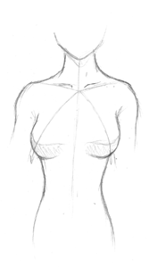 Here is another pose, showing the torso from a front view. Note how the breasts are still located at 45 degree angles from the center line of the body. Oh, also take note of the shading. After looking at various examples, I find that shading in this fashion (rather than just following the lower curves as you would shade a sphere) makes them look more natural.
|
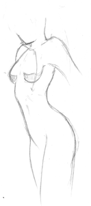 Here is one last pose to go over the size and placement. It's harder to see here, but the breasts are still at the 45 degree angle from the center line (which isn't draw in this picture; sorry about that ^_^;). Notice that the leftmost breast is drawn as a half-sphere, not as a full sphere. If you want to exaggerate the size, that's your choice, but I personally don't think its necessary.
|
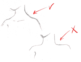 Now, lets move on to the neck and shoulders. When you draw the shoulders, notice that they are slope down smoothly, they aren't flat. Try to take the musculature structure of the neck and shoulders into consideration, especially if you are going for a more realistic look. They should be shaped more like a clothes hanger, and not drawn flat an hard.
|
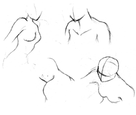 Here are some more examples of various shoulder positions. Notice that the shoulders are never drawn flat and dull.
|
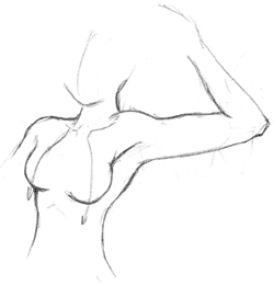 One more thing I wanted to cover regarding the torso is how to draw it if an arm is lifted. ^_^ I have personally found this difficult sometimes, so I figured it was a good thing to go over. If the arm is lifted, then the back of the torso will be exposed. Although a female's torso isn't as round and full as a males, it should still stick out in the back. Don't make the upper torso too narrow. Notice also how the top of the right-most breast doesn't just keep curving inwards in a circle; remember that it is not a full sphere, so it is attached to the muscles of the shoulder.
|
Arms |
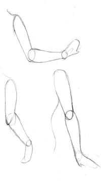 Next, let's move on to the arms. The arms consist of three basic sections: the upper arm, the foream, and the hand. Each can be represented in prelimiary sketches by oval shapes. Now, I know some people don't like using the shapes; you do not have to do it this way, this is just one possible way to go about sketching arms. Some books recommend using cylinders, but it's better to use flat ovals because they more closely match the shape of the arm. It isn't shown here, but if the arms are held loosely at the side, the hands should come down to the middle of the thigh. The elbows should be at about waist length.
|
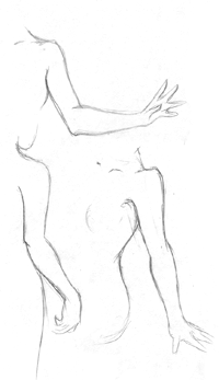 Once you have your basic shapes of the arms down, you can refine them and make them look more realistic. This is a little more difficult. ^_^ When drawing the arms, don't make them straight and flat; arms have muscles, after all. ^_^ Never draw a straight arm as just a long cylinder (unless you are doing a super-deformed/chibi pic). ^_^ The arm starts at the shoulder. Notice how the shoulder bulges out slightly, then curves back down. The arm tapes slightly inwards until you reach the elbow. At the elbow, the arm widens again just after the elbow where the biceps are (as shown in the topmost picture here). The elbow itself can be a little daunting to draw. Remember that the arm doesn't just start curving in the other direction; there is a joint, and it should be shown (as in the top and bottom left pic). There are more examples below.
|
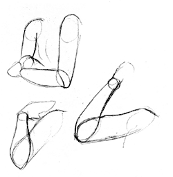 Here are some more poses for arms, this time showing how the parts of the arm overlap. It is sometimes easier to visualize the overlapping or foreshortening if you use basic oval shapes first, but again, you do not have to use them if you do not want to. Notice how in the topmost picture, the arm that is moving away from us tapers and grows smaller the further away from us it is.
|
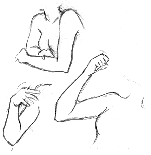 These poses are a little more difficult to refine. It is very important that you pay close attention to the way each par of the arm is facing, and how the elbow is to be positioned. Try to imagine the arm as two different shapes stuck together: the cylindrical upper arm, and the forearm, which is sort of shaped like a bowling pin with a bump on the bottom. ^_^ That should help you in determining the position of the elbow.
|
Legs |
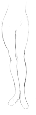 Legs can be another problem area for artists. It's hard to make them shaped properly (especially when you don't practice very much, like me... ^_^;) Just like with the arms, it is important not to make them perfectly straight like cyliders. It is especially helpful to use ovals to help you get the shape right rather than cylinders, because the ovals better suit the shape of the thighs and calves. The upper part of each leg should be thicker, rounder, and shorter than the lower part of leg. When drawing the legs, start them thicker at the top, then taper them down until the reach the knee. As with the elbow on the previous page, the knee should be defined; it's a joint and should be drawn, the leg isn't made of rubber. ^_^ Notice how the knee bulges outwards slightly; the leg doesn't just go straight down. The muslces on the lower leg, especially the calves, should protrude a little.
|
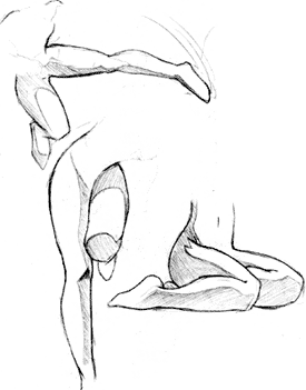 Here are some more poses. I didn't use the prelimiary ovals this time because I forgot, but you should be able to see the oval shapes of the various parts of the legs. Again, I would like to bring attention to the knee, especially in the lower pictures. When the leg is bent, the knee can be drawn like a flat plane. I shaded these legs to help give you a better idea of their form. There are better details on this in various figure drawing books, but since you don't often see every bone and muscle on an anime character, I didn't feel the need to go over everything. ^_^ On the picture to the far right, notice how the calves obscure part of the thigh. In the left pictures, notice that the lower part of the legs that are lifted up are not visible, since they are hidden behind the rest of the leg.
|
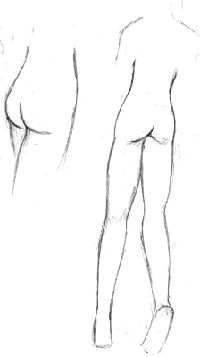 Well, just as its important to be able to draw someone from the front, you may also wish to draw them from behind. In which case, it helps to know how to actually draw someone's behind. ^_^ I wasn't going to add this, but since many anime girls are draw in skin tight suits or swimsuits, it's kind of important. Umm... I don't know quite what to say; just be careful how you make the legs connect to the rest of the body. There's more info in the next section of this tutorial. If you need extra reference, get that figure drawing book by Burne Hogarth mentioned in my recommended reading section. He has several pages devoted to the subject. -_^
|
Full Body |
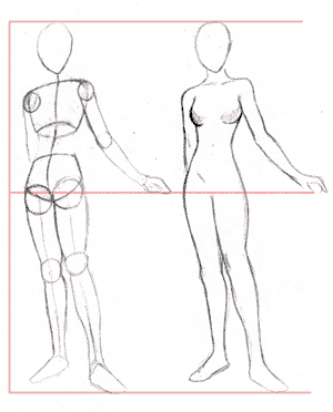 All right, now that we've gone over the major areas in detail, lets put them all together and make a full body pose. :) When drawing your subject, you can either begin with the prelimiary ovals and circles, or you can go straight to the final draft, whichever you are most comforable with. If you are using circles and ovals, then you will notice that the main body (torso and pelvis) are composed of two basic shapes, both of which curve inwards towards the stomach. I'm not going to go over these a lot, because they have been well documented in other figure drawing tutorials. ^_^ Make sure that both of these shapes, as well as the head, are aligned along a central guidline (as shown). This guidline is pretty much the spine of the character, and will determine the pose she is going to be in. Notice here that the center line curves to the left a little on the pelvis; this is because her weight is shifted and her left hip sticks out slightly (which makes the pose a little more interesting than if her weight is evenly balanced). The body can be equally divided in half as shown to by the red guidlines. You can use that as a general reference when determing how long the legs should be in proportion to the rest of the body, but often times in anime the length of the legs is exaggerated, for both males and females, and it looks just fine.
When drawing the midsection, remember to try to keep the hourglass figure shape. Female anime characters will generally have thin shoulders, a thin stomach, and a somewhat round waist. Be careful to make the curves look natural, unless you are really good at figure drawing and can exaggerate the proportions. |
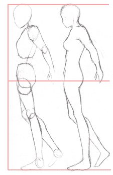 Here is a similar pose, this time shown at a side angle. I have found side views to be difficult, since I had a hard time finding decent reference pictures. ^_^ Notice that the body is composed of the same basic shapes, except the shapes have been rotated around. One of the things you need to consider when drawing from this angle is the shape of the upper torso. It isn't shown very well here, but as you come straight down from the neck, the chest will stick out slightly at a sharp angle as you come to the collarbone. After that point, the torso is drawn at a smooth diagonal until you reach the hemisphere shape of the breasts (remember that they are half spheres; don't draw them like beach balls!) Beneath that, the torso continues to protrude outwards slightly until reach the bottom of what would be the ribcage (its a little over one headlength down from the shoulders). After the ribcage, curve back inwards a little for the stomach. Other things to look out for are the shape of the legs (the thighs round out in front, and are flatter in back, while the lower legs are just the opposite) and the subject's behind (make sure you don't exaggerate it too much).
|
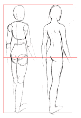 For the final pose of this tutorial, here is an example of someone drawn from behind (which you may actually need to draw at one point, especially if you are going to do manga ^_^). Just as before, the subject can be equally divided in half. Things to look out for at this angle include the neck; it connects up into the skull, and should obscure part of the face. The midsection should be somewhat hourglass shaped, but again, don't overexaggerate the curve unless you really know your anatomy (you have to know the basics before you can start bending the rules). Don't overdefine the lines on the behind, since there's little reason too. Be careful when drawing the arms; from the back, the elbows should be more prominent than usual. Check out the section on arms for more information.
That concludes the female figure drawing tutorial. I hope this gives you an understanding of basic anatomy, and helps you out when drawing full body subjects. :) |
Все взято с http://www.howtodrawmanga.com/tutorial/tutorial.html.
Кто все это вдруг переведет для опубликования на ПокеЛиге и пришлет мне, скажу только ОГРОМНОЕ спасибо!
Объединял странички и отбирал посетителей у www.howtodrawmanga.com -- Geodude-сан.
Кто все это вдруг переведет для опубликования на ПокеЛиге и пришлет мне, скажу только ОГРОМНОЕ спасибо!
Объединял странички и отбирал посетителей у www.howtodrawmanga.com -- Geodude-сан.
| Разное |
|---|
| ПокеВики Showdown! |
| Быстрый доступ |
| Чат Журналы ФанАрт |
| Пользователям |
| [Регистрация] [Активность] |
| Голосование |
| Кто в онлайне |
| Друзья |
   [Наша Кнопка] |